Introduction
We have discussed survival analysis elsewhere, such as in this post on the Cox proportional hazards model. Here, we'll show you how to graph the Kaplan-Meier function in Stata.
Call Dataset
Try the following code to load the cancer dataset that comes with Stata:
sysuse cancer
Run the Model
stset studytime died
sts list
The first line of code uses stset to declare the data to be survival data. The next word in the code, studytime, identifies the variable that tracks time. The final word, died, tracks the variable that captures the failure outcome, which is death. The second line of code lists the data for you:

We can assume that time is in months. So, in month 1, 48 total people are at risk of the failure outcome (that is, death). In that month, 2 people died. In month 2, 1 person died. Also, in some months, people were lost to the study. By the end of the 39th month, there is no one left to track, because the last person at risk left the study. Directly after stsetting the data and listing it, we can generate the Kaplan-Meier graph.
The Kaplan-Meier Graph
This line of code generates the graph:
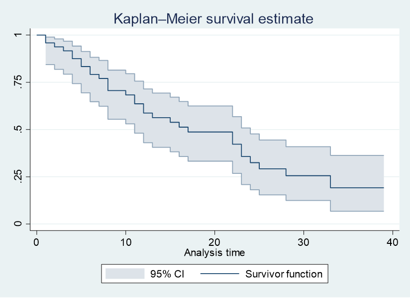
sts graph, ci

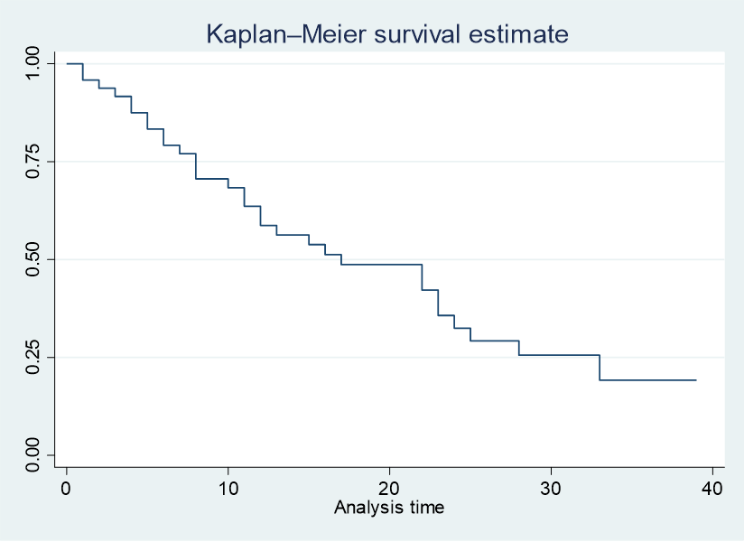
You can see the way in which, from months 1 to 39, the odds of surviving drop from 1 to close to 0. We added the term ci to generate the confidence interval, but you can also leave it out, in which case:
sts graph
And:

The Kaplan-Meier Graph, Adjusted
This dataset tracks 3 treatment types in a variable called drug. We can create a new Kaplan-Meier graph that tracks survival by drug type. Try the following code:
sts graph, by(drug) ci
You get the following graph:

As you can see, the subjects taking the other drug and the drug marked NA survive for longer periods of time than the subjects on the placebo.
BridgeText can help you with all of your statistical analysis needs.


.jpg)


